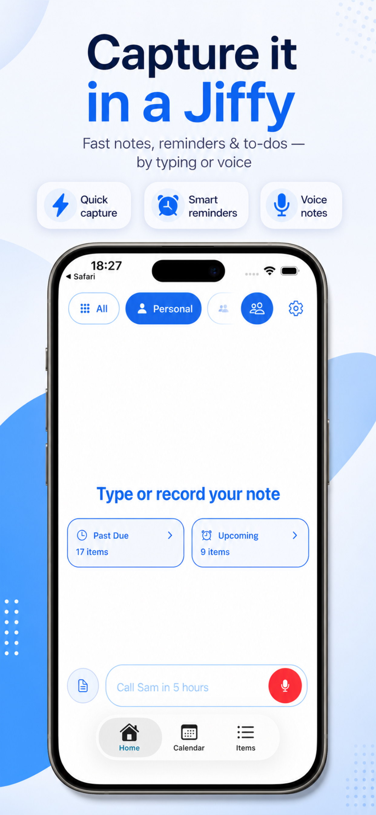
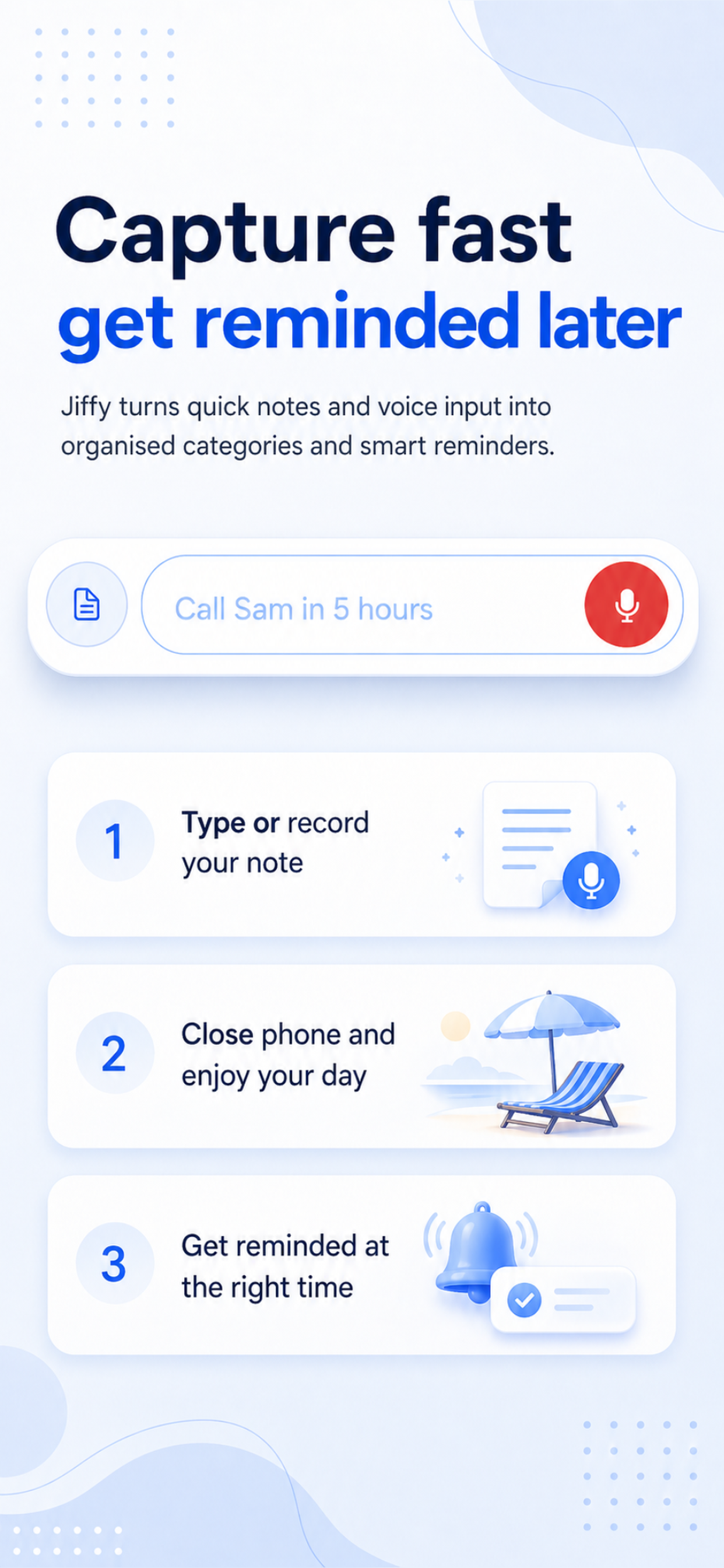
← Back
Case Study · 2026

Jiffy: notes, tasks and reminders that feel almost frictionless.

I built Jiffy for people who don't want to maintain a system. Write down what matters, when it matters, and trust the app to handle the structure. The whole product direction was about reducing setup, reducing taps, and reducing decision fatigue.

Jiffy home screen showing notes, tasks, and reminders
Platform
iOS and Android
Category
Notes, reminders, shared planning
My role
Design, engineering, product

Inside the product

The starting point

I wanted a reminders app I'd actually open.

Every reminders app I tried eventually became something I avoided. Too much setup, too many taps, too much cognitive overhead for something that should take two seconds. Jiffy started as a personal frustration — I just wanted to write things down and trust the app to handle the structure.

Jiffy home screen
Natural language

Type it the way you think it.

Instead of forms and pickers, Jiffy lets you write 'Doctor appt on the 22nd at 11.30am' and figures out the rest. The goal was zero ceremony — open, type, done. I spent a lot of time on the parsing because the interaction model depends on it feeling instant.

Jiffy calendar view
Visual approach

Quiet interface, loud content.

I took cues from conversational products I actually enjoy using: clear hierarchy, generous spacing, obvious next actions. The UI should disappear. Your notes, tasks and reminders should be what you see.

Jiffy list view
Sharing

Groups that don't require a group chat.

I built shared spaces for families, couples, friends — places where notes and reminders live together without the chaos of a message thread. Coordinating with people shouldn't mean switching between three apps.

Jiffy smart groups
What I learned

Taste matters more than velocity.

Shipping is easier than ever. The harder problem is knowing what should exist at all. I cut more features from Jiffy than I shipped. Fewer noisy things, tighter defaults, stronger clarity. That constraint became the product's point of view.

Jiffy fast record screen
How it landed

Familiar enough to trust, refined enough to feel different.

I didn't try to reinvent every interaction. Instead I improved familiar patterns with more precision and less friction. That made onboarding easier for people coming from existing tools, while still giving Jiffy a distinct feel.

Jiffy editor screen
Takeaway

Jiffy is strongest where most productivity apps overcomplicate things.

Capture, scheduling, and sharing. By keeping the interface familiar and the interaction model conversational, I tried to build something calmer — for people who want help staying on top of life without becoming power users first.

Download Jiffy on the App Store